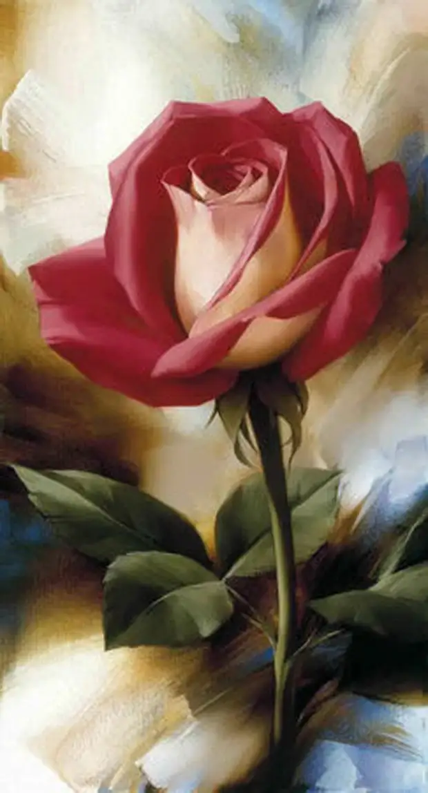
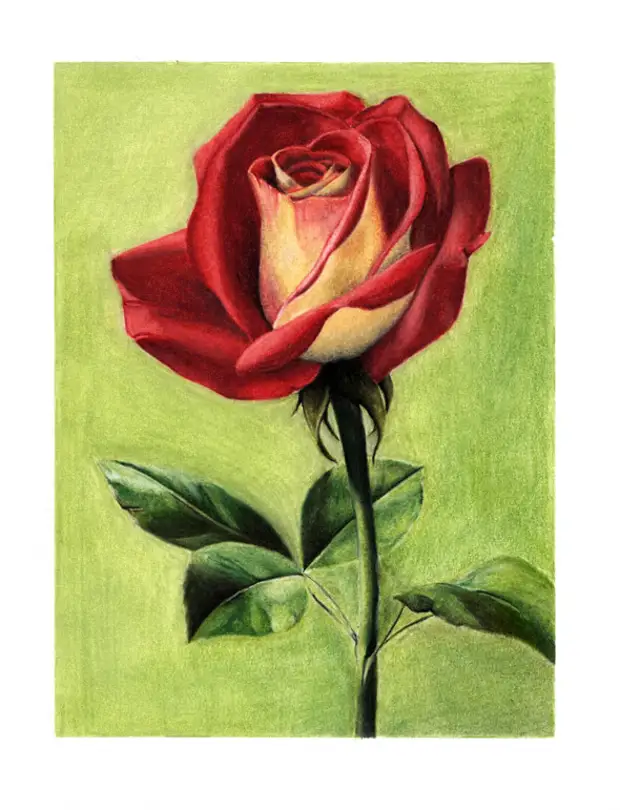
Today we will draw a rose on the picture of the artist Igor Levashov.
1. Materials
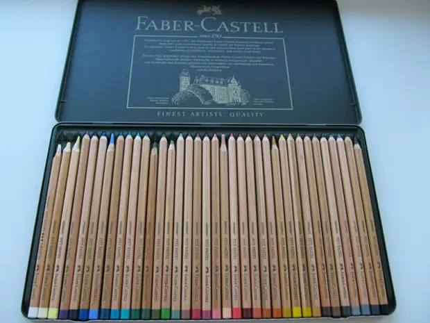
1.1 Draw we will be pastel pencils, but not necessarily pastel, it is quite well suitable for just colored so and watercolor, in my case it is pastel Faber Castell Pitt 36.
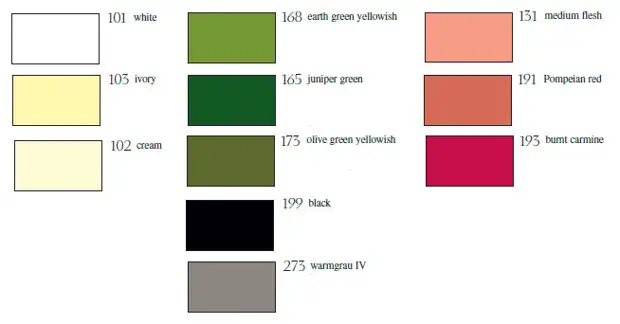
In my work I used the following colors:
1.2 Paper. For this work, I used the matte photo paper A4 Lomond 230 gr. Yes, this paper is not the best variant for pastels, because it is smooth, but it is great for giving such smoothness of the drawing, and the pastel does not even lie down and keeps on it.
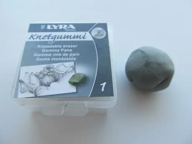
1.3 Klyachka.
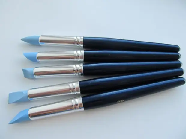
1.4 Textual brushes. These are rubber decisions, are perfectly suitable for pastels, for the decisiveness of small details.
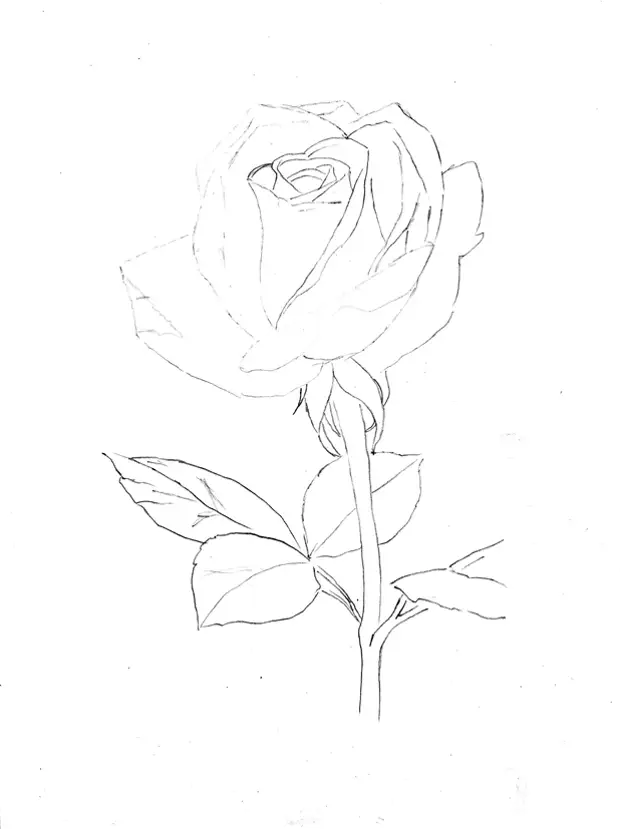
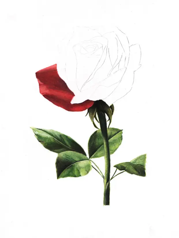
2. Sketch
3. Staking drawing
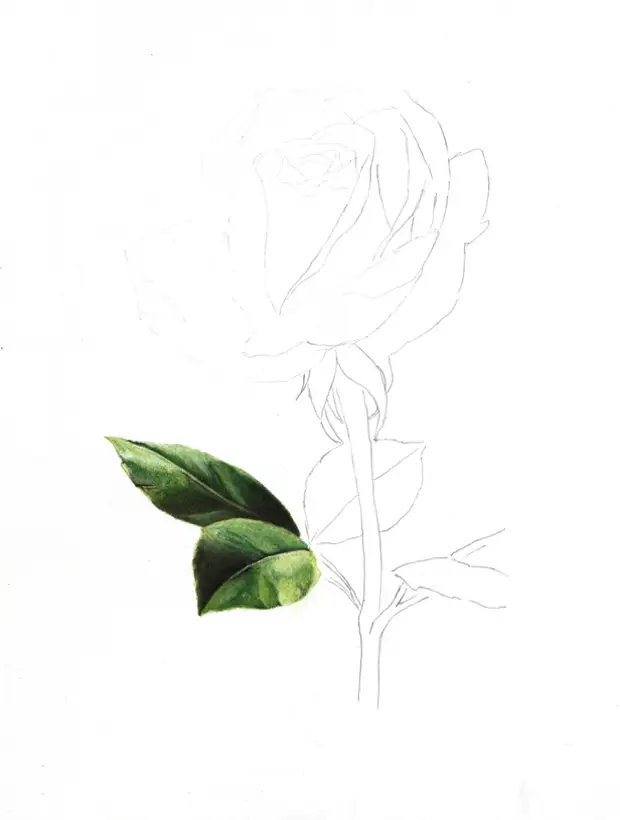
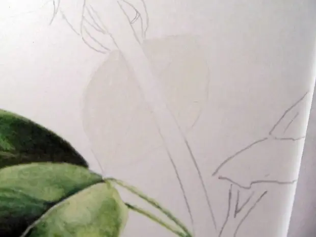
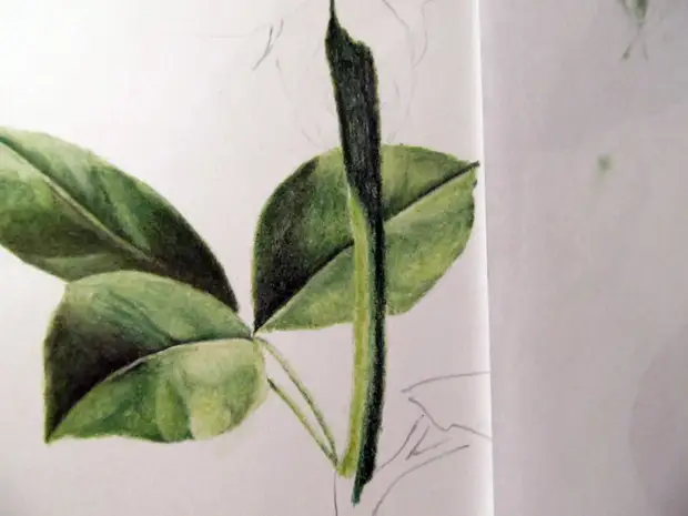
3.1 Sheet and stem
So, I began to draw from the leaves, I started writing not from the very beginning, so I have already been ready 2 leaves, then I will tell you how I painted another piece of stages
Phased Demosturation.
To begin with, cover the area of the sheet with white (101)
Next, color 168 cover the area of the sheet, leaving the desired light areas not painted
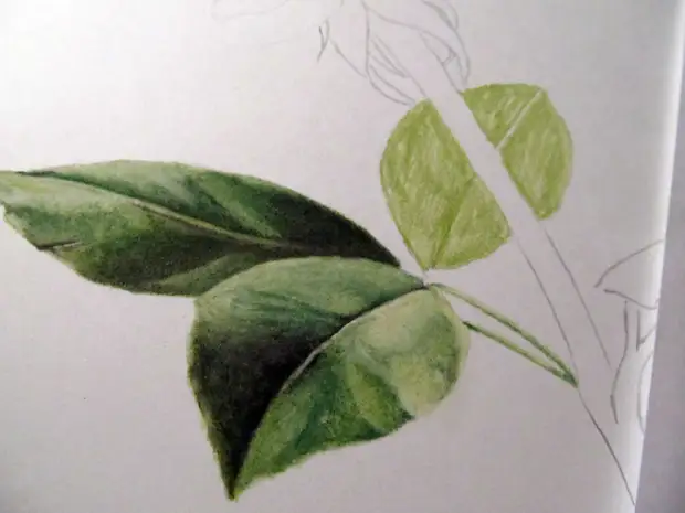
Color 165 Wealth the Dark Areas of Our Sheet
Rentifying
Black 199 intensively shadowing the areas and repeat again
Then the colors 102 and 168 bring the sheet to the result we need, 102 cream imposing on top of it, as if it rinsing the bottom layer and makes it lighter
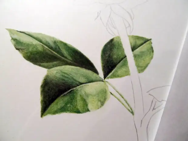
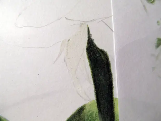
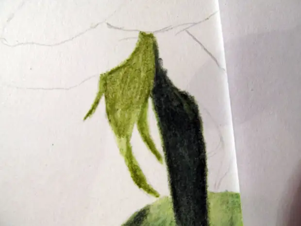
Next, we will begin drawing the stem of our rose, we do the same as with our sheet, first white 101, then 168, we rub, then 165, we rub, 199 black and repeat again, and we are finalized with cream 102 and green 168
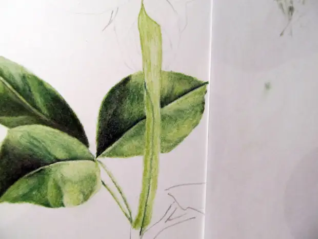
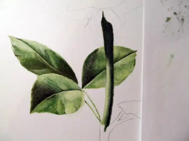
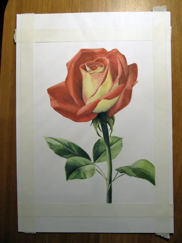
As a result, we get:
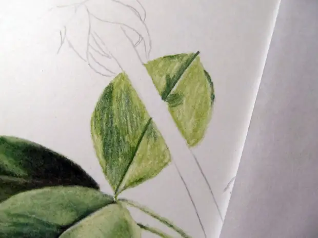
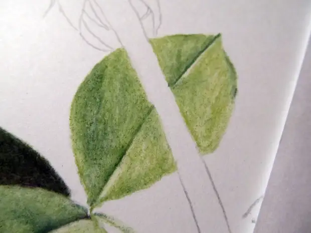
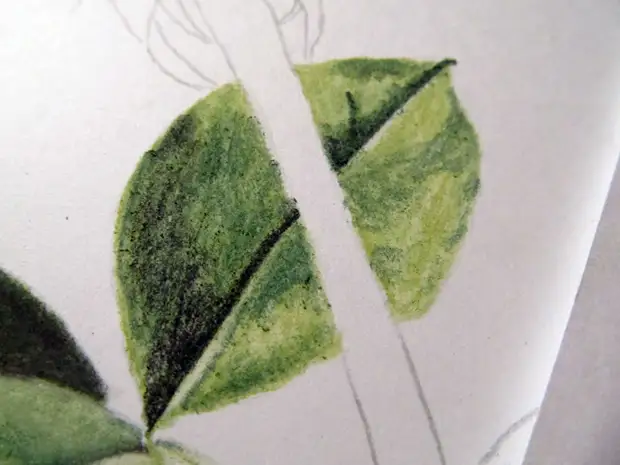
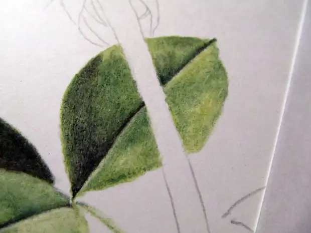
3.2 leaflets under bud
In this stage, you will not recognize anything else, all the same as in the previous stage, except that instead of color 165 we will take color 173.
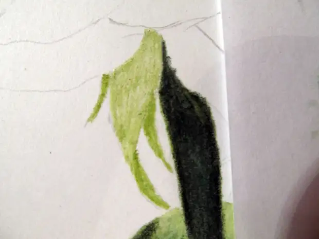
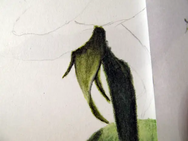
Outcome:
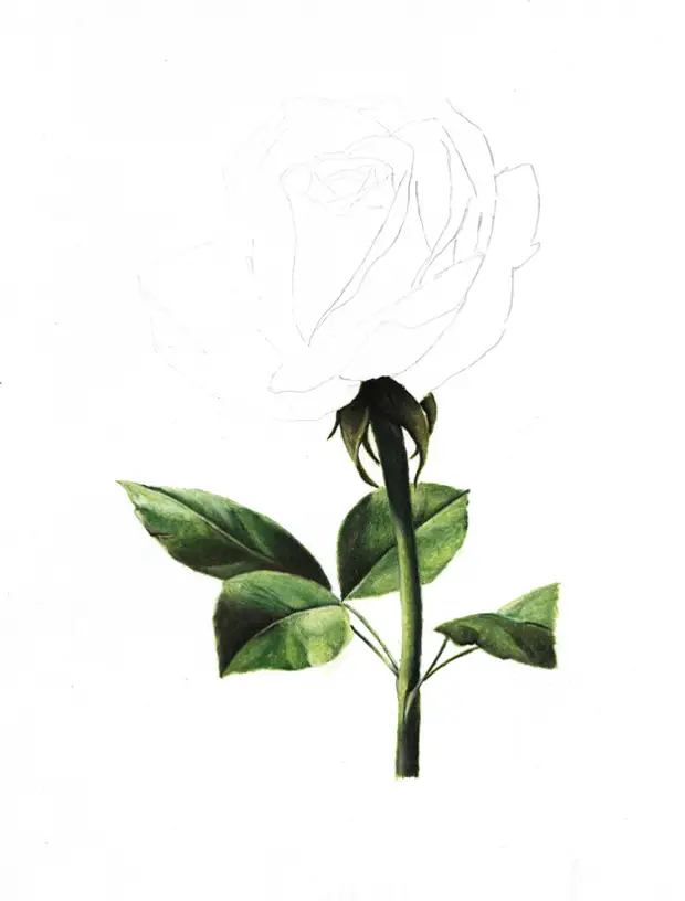
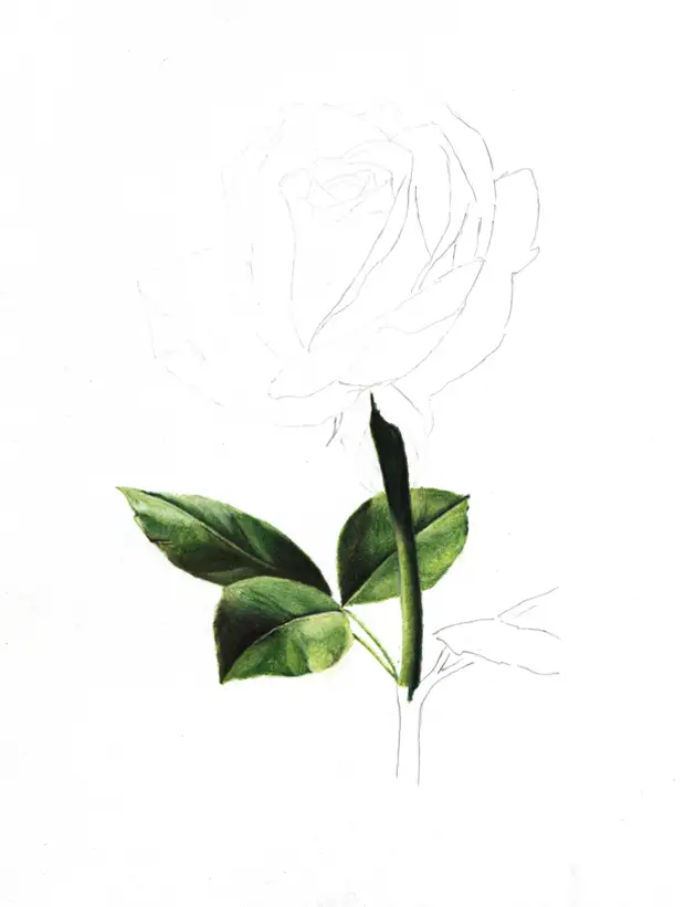
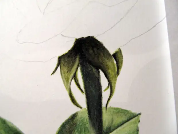
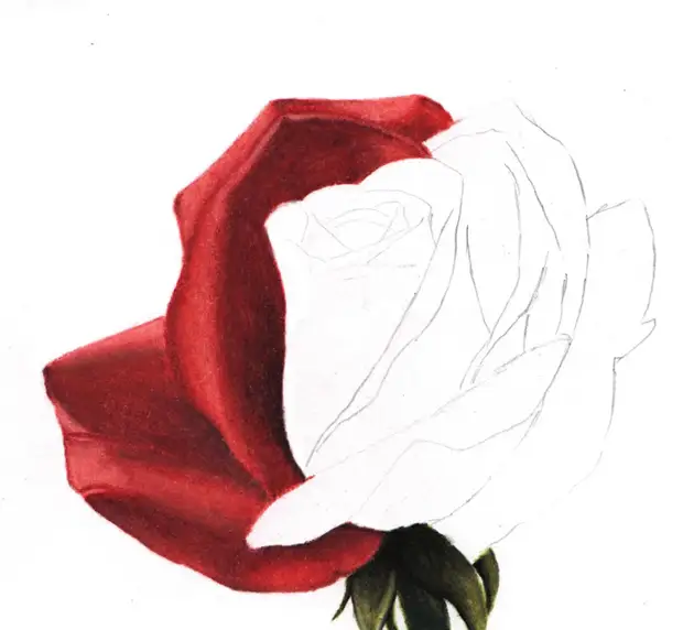
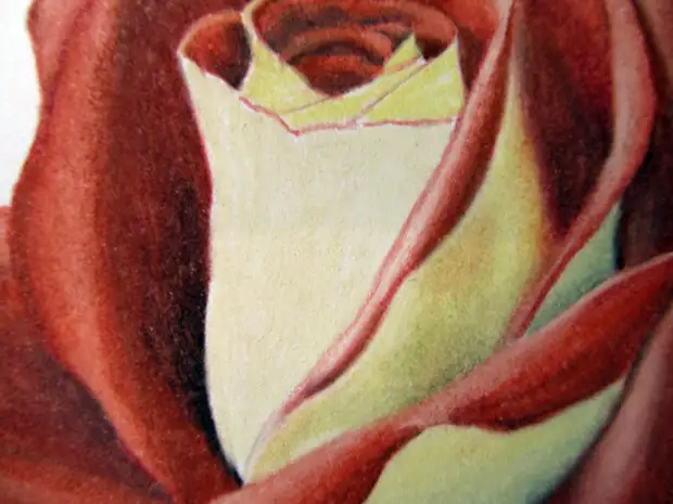
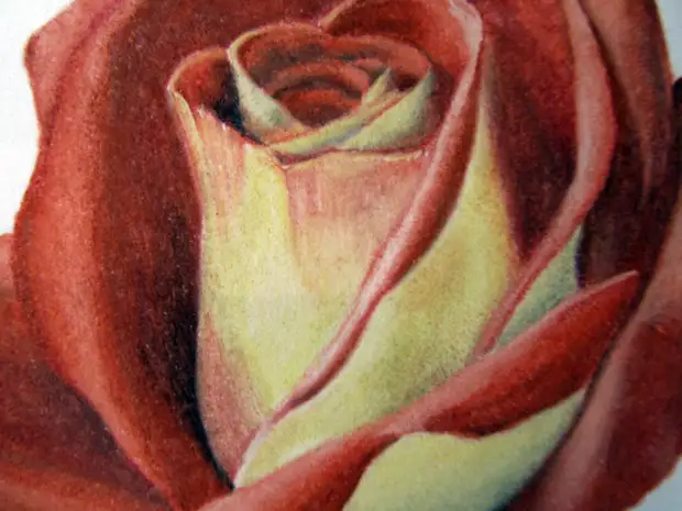
3.3 Bud
And finally, we proceed to the most important thing in our work, to the bud of our rose. I will not tell how I painted every petal, here the main thing to understand how to draw, how to convey the volume, I will show how I painted one petal red, and inner yellow. Let's start
We take the color of 131 and fill the area of the sheet with color, highlighting the places we need lightly and immediately we undress.
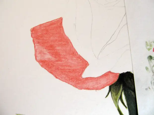
Next, color 191, also cover the area of the sheet leaving the bright areas
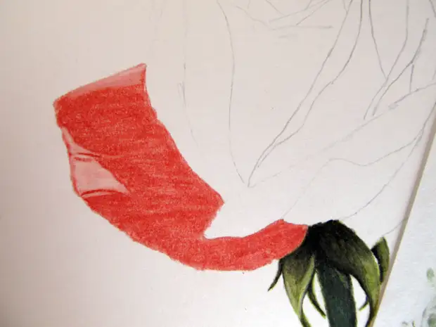
Then we take the colors of 193 and 199 and we begin to give the volume to our petal, first in 193, we add tones, we decide, then with a black more shaded and rub
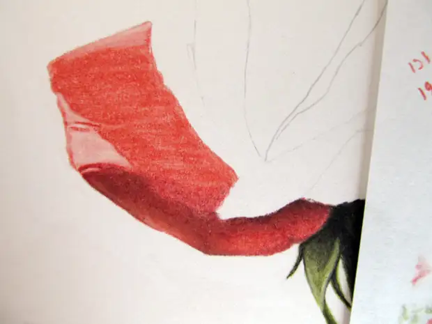
On top of the superimposed black color, you can walk in color 191 to as it were to grow and weaken black and give smoothness.
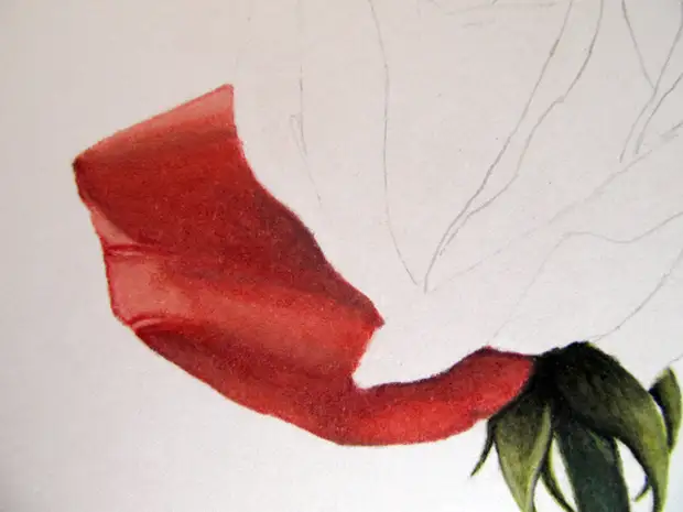
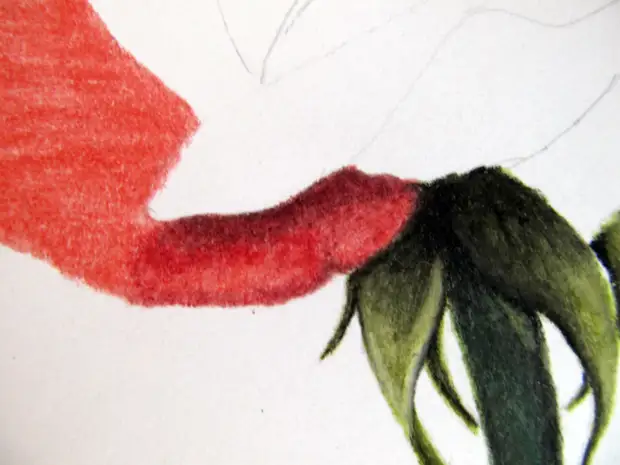
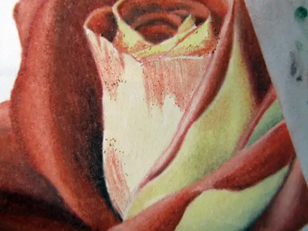
Next, continue to work out the rest of the petals following the example of the previous one, giving them the desired volume
So, internal yellow petals, all the same with color 103. Also in the palette you can see the gray color 273, here it is useful for us to give the volume and create a volume for some petals. Color 103 cover the area of the leaf, add colors 103 and over 191, we decide, shadow color 193
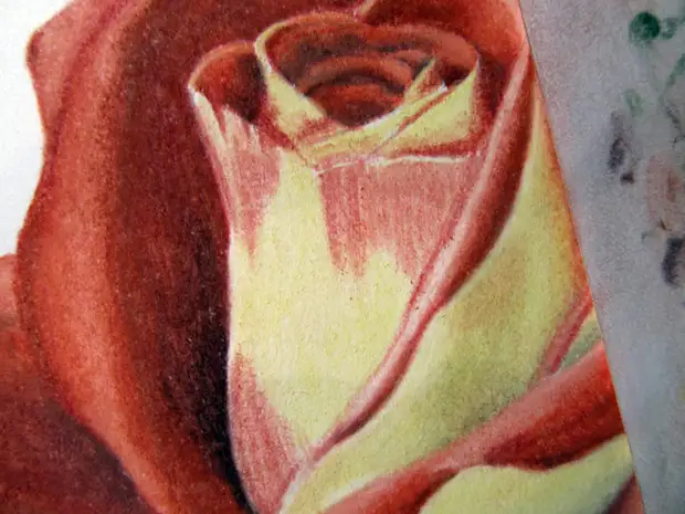
The work on the flower is over, the background remained, in the Original he is quite complicated, I decided to simplify it to just green, and honestly, I expected that he would come out a little better, but I think that it is also good. To begin with, we glue to our work on the edges of the Malyal Scotch to leave the frame.
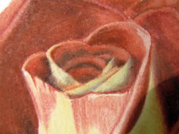
Next cover the background with color 168 and rub it
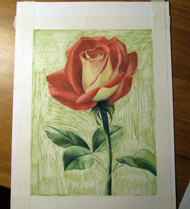
And then we drag the background, adding a dark green 165 to the right to bottom and lightening white on the left side.
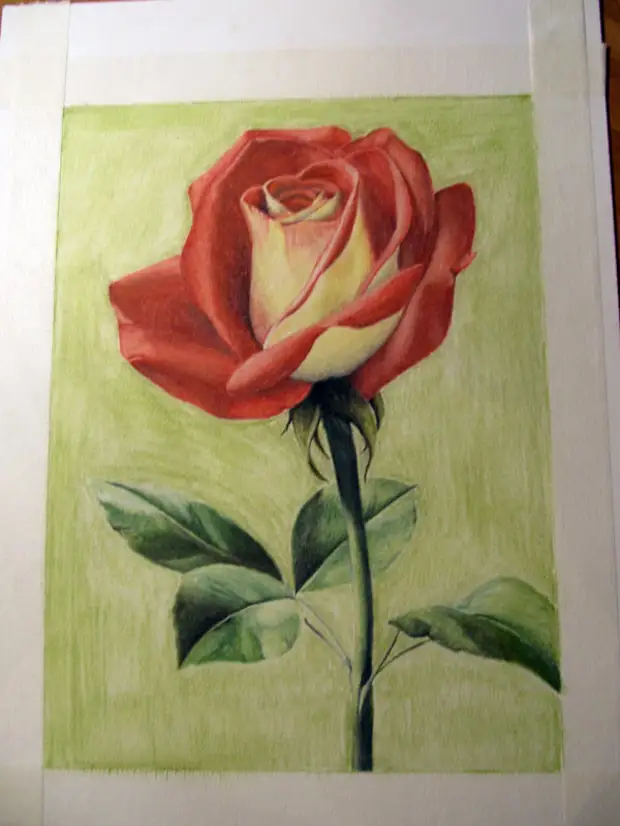
Final Relattat
A source